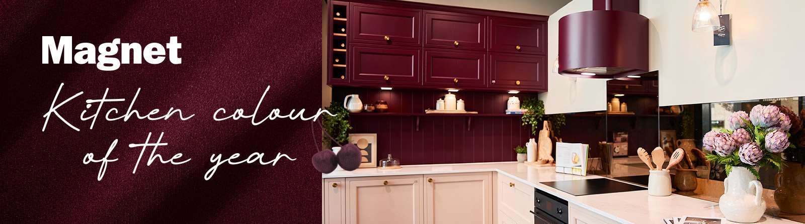
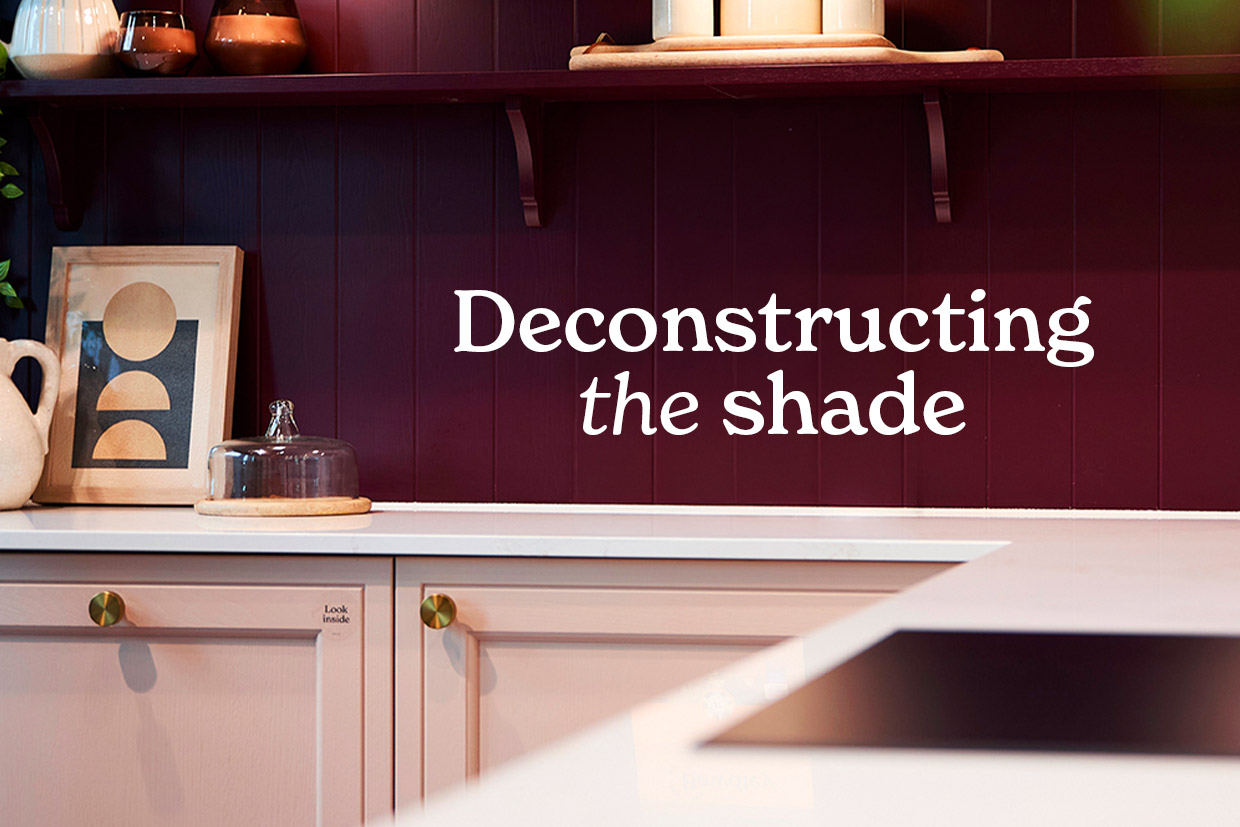
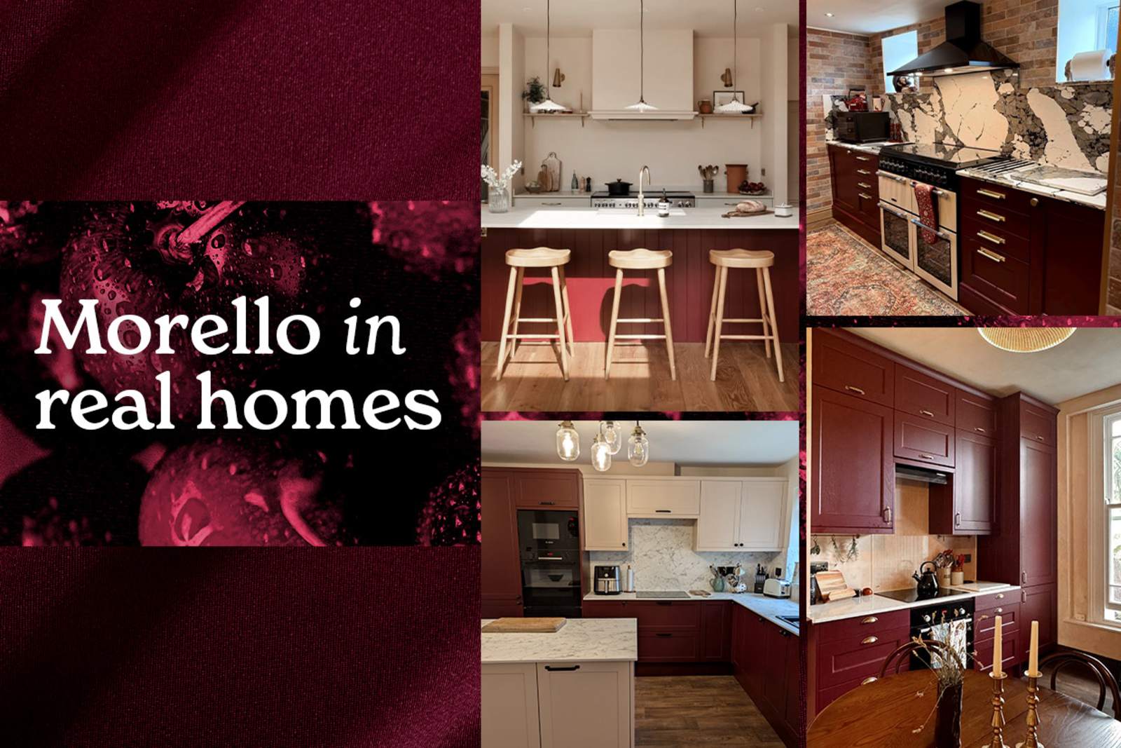
Laura: While there’s been a strong shift towards beiges and soft neutrals, we still see a need for an impactful colour to combat that neutrality, stand out, and create a true presence in the home. Choosing the right shade of red is notoriously tricky because there are so many variations, and not every shade translates well into a kitchen environment. We knew we needed a deep cherry red to make it work seamlessly within our palette. Across our paint-to-order palette, it’s the deeper, more saturated shades that often create the most striking interiors. We’re not afraid to be bold when it comes to colour, but every shade is selected with the wider design in mind. Morello is no exception.
Laura: As we move into the cooler months, people naturally crave a warm, cosy, cocooned environment – going for a darker tone really creates that. It’s all about creating an emotional atmosphere – with the right setup, deep cherry tones feel luxurious, warm, and inviting.
But Morello isn’t limited to the moodier months. As we move through the seasons, the way it’s paired can completely shift its character. It works beautifully with lighter woods, soft neutrals and natural textures to create a fresher, brighter feel when the days start to get longer.
Laura: There’s a common misconception that drenching an entire kitchen in a bold colour will feel claustrophobic or overpowering. In reality, colour-drenching creates a wonderful, cocooning feel where the space feels warm and unified. If you dare to be brave, drenching the entire kitchen in an impactful shade like Morello creates a stunning theatrical outcome – it’s very much a case of seeing it to believe it.
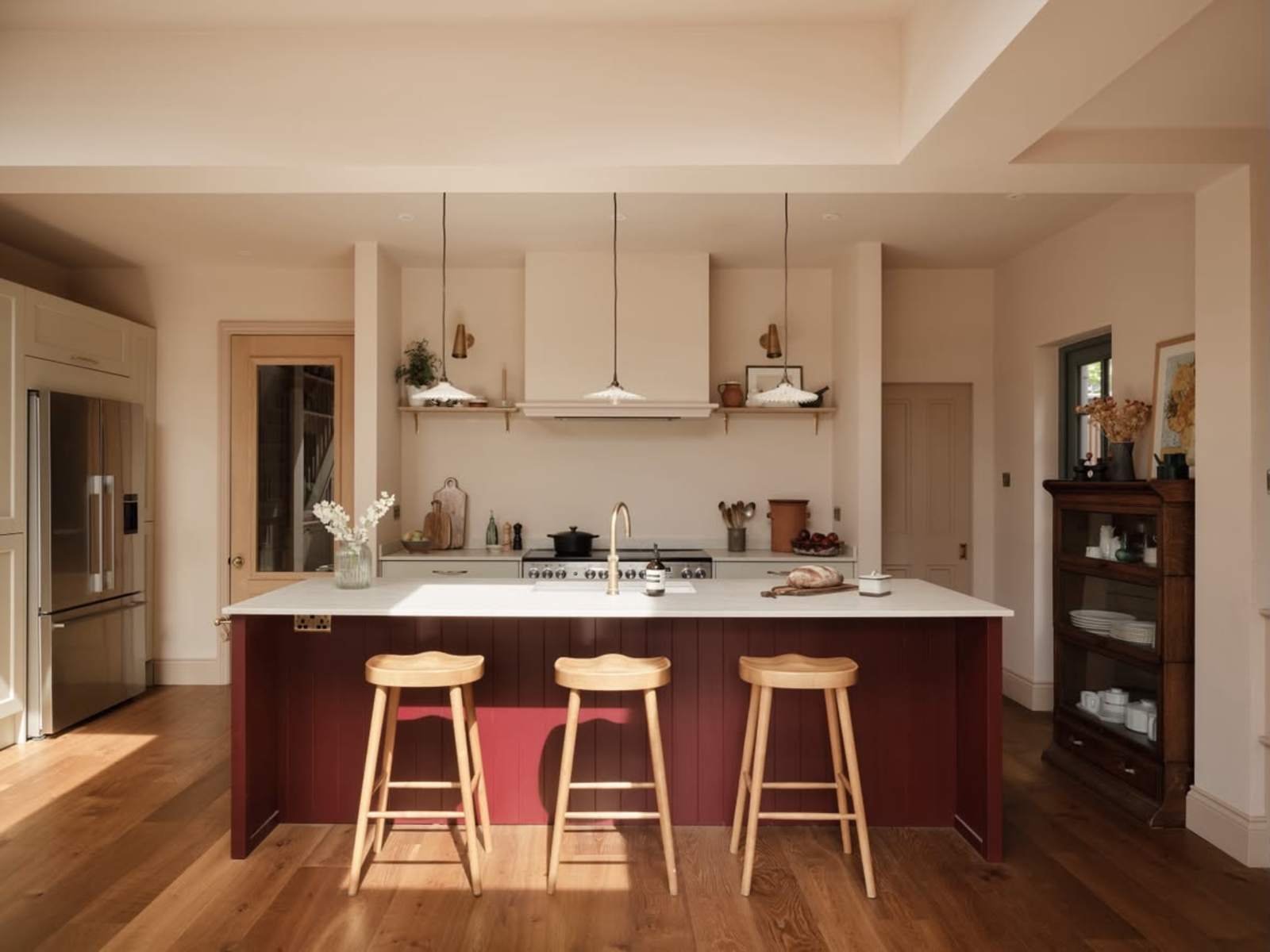
Laura: If full colour-drenching feels a bit out of your comfort zone, meeting in the middle is the ideal approach. Morello pairs perfectly with lots of our neutrals; parchment, shell, limestone or linen – having a splash of Morello in your kitchen can provide just as bold a statement. It allows you to incorporate the rich colour you love without feeling like you've pushed yourself too far.
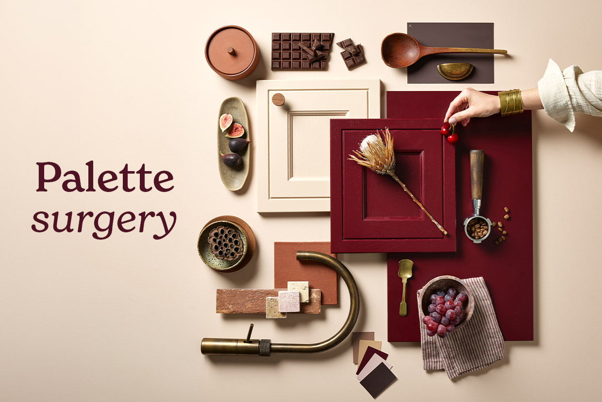
Laura: Morello pairs exceptionally well with rich walnut woods and warm metallic accents. Brass handles and details really make the red tones shine while adding a soft, warm hue. On the other hand, black accents give Morello a modern, crisp, and architectural feel. Don’t be afraid to lean into darker pairings – a rich walnut floor or worktop brings immense richness to the space.
Laura: A lot of people assume that if you choose a bold frontal, you have to play it safe with a plain worktop. There is no reason you can’t pair a Morello door with a dramatically veined marble-look worktop. It instantly elevates the design, makes the kitchen feel luxurious, and adds an extra layer of sophistication and elegance.
Laura: Focus on non-permanent touches to layer in that rich tone. Blinds, floor runners, and textiles are quick wins. You can also lean into seasonal styling: moving away from light summer florals towards deeper botanical arrangements, branches, and rich autumnal displays naturally echoes the depth of Morello.