


Kitchen Colour Combinations
The right colour combination can completely transform how your kitchen looks and feels. Explore timeless palettes, emerging trends and expert design advice to help you create a kitchen colour scheme that reflects your style and enhances everyday living.


Our guide decodes kitchen colour trends and processes for discerning the best colour for your kitchen, so you can begin building your own kitchen colour palette.
Timeless kitchen colour combinations
These kitchen colour combinations always feel clean, contemporary and inviting.
-
- Warm or blonde wood cabinets and stools with white worktops and walls
- Duck egg blue walls with oak tables, chairs and white accents from cabinets and radiators
- Sage green walls with walnut furniture offer a traditional country cottage feel


Trending kitchen colour combinations for 2026/27
The newest colour designs often take popular or timeless colour combinations in a subtle but inspired direction.
- Forest green walls, cabinets and textiles teamed with natural wood worktops create a natural, earthy alternative to the high-end luxuriousness of the rich dark green and chrome accent trend.
- Muted olive cabinets and tiles combined with cream worktops and walls offer a fresh take on the classic sage green palette.
- Black cabinets, walls and black cast iron ranges teamed with oak worktops and furniture make a strong statement even with their subdued tones. It’s a style that appears to take its lead from other recent moody colour trends such as dark academia.
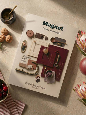
- Morello red and Chalk Blush is one of the standout kitchen colour combinations emerging in contemporary kitchen design. The richness of Morello creates a striking focal point, while Chalk Blush softens the scheme with subtle warmth, resulting in a look that feels both timeless and on-trend. Discover more colour trends and expert design inspiration in the 2026/27 Kitchen Trends Guide.
Popular colour palettes for kitchens
It would be wrong to see popular kitchen colour combinations as simply those with “mass appeal”. These colour palettes crop in kitchens time and again precisely because of their distinctive personality and lasting impact rather than resale appeal.
- Earth-toned kitchens offer a warm and neutral aesthetic, specifically those that make use of beige, blonde and deep brown woods, with off-whites and creams.
- Matte colours entered the mainstream a few years ago for their strong depth of colour and laid-back aesthetic, which is noticeably different to popular high gloss commercial designs.
- Navy kitchens developed a strong following and continue to remain popular thanks to their versatility. They are often paired with white or charcoal worktops and set against crisp white walls or complementary shades of blue.

Best colour combinations for a large kitchen
With ample room to play with, almost no colour is off the menu. Larger kitchens allow you to experiment with shades and finishes that may feel overwhelming in more compact spaces.
- Black and other moody hues paired with brushed metal finishes can be challenging in smaller kitchens, but in larger spaces they bring a sense of quiet luxury, creating depth, warmth and a striking focal point within the room.
- Taupe and smoky grey or charcoal is a popular variation on this theme.
- The rich red and brown combination of burgundy and walnut is opulent and warm, perfect for creating a cosier feel in large spaces.
- The light absorbing quality of matte colours also make any combination - bright or dark - a win for larger spaces.
Best colour combinations for small kitchens
Smaller spaces, and especially pantry areas, will benefit from light colours and reflective finishes to assist the travel of light around the room.
- Differing shades of white across walls, countertops and cabinets add interest while maintaining an open and airy feel.
- Two main colours, such as pale blue and cream or light grey and pale pink, will help to avoid visual clutter.
How to balance the tones in your kitchen
A sneaky tip for balancing the tones in your colour palette is to use the 60:30:10 rule, where the dominant colour occupies 60% of the space, the secondary 30%, and the accent colour is used across 10% of the space. How you apply this ratio to the available elements in your kitchen is up to you.
For a less mathematical approach, you can consider the impact of colour from certain fixtures.
For example, a floating kitchen island in a dark colour could be used to create depth and an anchor point for the entire kitchen space around which to bring in other shades or complementing colours.
The complex grain in wood cabinets or natural stone worktops could provide the inspiration for a palette of colours which can be extended to different areas of the kitchen.
Cabinet handles - whether matt, chrome, or a contrasting white - can also be used to make rich-coloured cabinets pop.
If you prefer a more monochromatic look, you can also use different textures rather than colours to create a perceptible difference in the colour scheme. On the other hand, if you’re struggling to tie together two or more colour schemes, a bridging colour, perhaps across tile work, can help to create balance and bring them together.
How to build a colour scheme
While kitchen colour combinations draw upon many sources of inspiration including trends, personal preferences and colour theory, a simple way to start your search for a kitchen colour scheme is using colour psychology.
Make a list of your kitchen elements which can contribute to the colour palette
Whether you’re installing a brand new kitchen or working with existing features, you’ll need to consider the interplay of colours from different sources.
The list is longer than you might think. Depending on what you have in your kitchen, you can control or incorporate different colours from:
- Upper cabinets
- Lower cabinets
- Countertops
- Ceiling
- Beams
- Splashbacks and other tiled areas
- Floors
- Handles
- Taps
- Shelves
- Visible light fixtures, such as chrome pendant lights
- Bar stools and other seating
- Islands
Once you’ve identified all the potential colour influences in your kitchen, you can decide the role each one might play through its colour.


Use colour psychology to narrow your preferences
For example:
- Cool blues exude calmness.
- Yellows are associated with energy and cheerfulness.
- Reds (and other warm, deeper colours) are said to stimulate appetite.
Colour drenching also has a psychological benefit. Using varying shades of the same colour throughout a space can create a cohesive, calming environment, allowing the eye to move naturally around the room without being distracted by strong contrasts.
Ultimately, the best kitchen colour scheme is one that reflects both your personal style and the way you want your space to feel. If you'd like to explore the emotions and atmosphere different colours can create, explore more kitchen colour ideas.

More from {{slotProps.categoryNames}}

Dedicated designer
Your expert, your guide, your go-to. From first hello to final fit.
Kitchen Retailer of the Year
Magnet has been recognised with four major wins for 2026.
Lifetime cabinet guarantee
All of our pre-built kitchen cabinets are guaranteed for a lifetime.